


It’s been over 11 years since Rebbix started. It’s also been over 11 years since we developed our previous branding.
In this time, we have changed, grown, landed ever greater challenges, achieved ever greater results, but our branding remained the same. We consciously turned a blind eye for a while. After all, delivering the best possible quality of service to clients and being the best possible employer for our team mattered a lot more.
But eventually, our branding fell so far behind, it no longer felt like Rebbix. And so, we embarked on a rebranding journey.
The prep
Hold on a sec. There’s one crucial task we completed before diving into rebranding, and that was defining in very clear — and very narrow — terms what it is we do. Who are our ideal clients? What exactly can we do for them? What can we do better than everyone else? We knew the answers to these questions well but resisted putting them in writing and plastering them across all our digital surfaces. It felt limiting and a little intimidating.
Still, it had to be done. A strong brand doesn’t exist without a strong value proposition, and we absolutely wanted a strong brand.
At last, we agreed that our main strength was building highly effective product engineering teams for startups and enterprises and our favorite line of work was helping products launch, pivot, find product-market-fit, scale, and reach millions of users.
Only then we were finally ready to wrap our offering in some words and visuals. Back to the main story.
The goals
They say you have to start with “why,” so here are the whys of our rebrand:
1. We wanted to stand out from the pack
Let’s face it, the tech outsourcing scene likes to play it safe. Everyone wants to be different, yet somehow most end up with green or blue logos and a clean and professional but ultimately bland look and voice. Our previous logo was green and blue too, by the way.

With the new branding, our goal was to really look different, even at the cost of not being instantly recognizable as a tech company.
To that end, we ran a small research on visual identities within our niche to understand who we were standing against. It quickly became apparent that one sure way to differentiate ourselves was through color, and that color was pink. It’s not what you’d expect from an engineering company, and that’s exactly why we loved it.
We should add here that this reason isn’t entirely superficial. Looking different for the sake of looking different is a valid cause in and of itself, but we also are different from the typical company in our industry, and our branding had to highlight that. More on this right below.

2. We wanted our branding to capture the spirit of Rebbix
We’re all product-building pros here at Rebbix, but we didn’t want our brand to give off that sterile, “professional” feel. Simply put, we just enjoy creating great products together, with all the experimenting, learning, trying, failing, succeeding, and genuine fun that goes into it.
We like our work because we believe in projects we take on and because we don’t allow procedural BS interfere with it. That’s a huge part of why both our clients and our team choose us and stay with us for years.
So this combination of solid expertise, hands-on approach, and fun-loving essence had to be at the heart of our new brand.

This is roughly what we communicated to our partners and friends at the creative agency and action. After a series of branding discovery sessions, they came back with two concepts, one of which immediately resonated with us. And so, the central element of our visual identity became…
The outcome
PINK MODELING CLAY!

Not an obvious choice, so hear us out. Modeling clay is:
- Simple, unpretentious, and fun, but also,
- Widely used professionally for prototyping (including car design),
- Visually versatile (you can make anything out of modeling clay),
- Great for creating memorable merch,
and, most importantly,
- Definitely different.

Modeling clay is the perfect visual cue for something that’s playful and unserious while also being practical and professional. It fits right in with the down-to-earth vibe of Rebbix.
We asked Khrystyna Boyko, business developer at and action, to share a few words on the process of developing our branding, and here’s what she had to say:
“This is one of our favorite projects! And we think it's slay! We immediately felt a match with the client in terms of creativity and approaches to work. At the same time, it was a great responsibility to do a radical rebranding for Rebbix. On our way, we used many creative techniques and worked on a big concept idea. We knew we wanted to keep the BB in the logo and have a pink color. We experimented with forms, fonts, and combinations but we still needed to find a single concept. And then our designer Phil just said: ‘Guys, what do you think about modeling clay?’ And that was it. With this phrase, he opened up our creative flow, the first step to the final concept.”
The flexibility (not softness, mind you!) and applied nature of this material also happens to work well as a symbol for our key expertise, which is building product engineering teams that are all different but always exactly right for the specific product challenges clients need us to tackle.
The website
Once we were settled on our visual identity, we moved on to a no less important step — the creation of this very website. For this, we enlisted the help of another group of friends and partners, Happy Design.
The goals we set for the redesign were consistent with the entire rebrand: our website had to be unlike what our competitors have and create an expectation of what we’re like as a company for potential clients and team members.
Here’s what Anton Lukashchuk, the main creative mind behind this website, shared about what is was like for Happy Design to work with us:
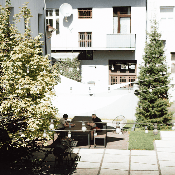
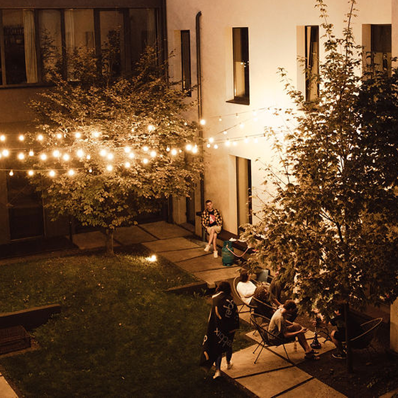
“From the very first meeting Rebbix made the impression of a company where people and sincerity aren’t just words on paper but real values that make this company special. With a courtyard that has BBQ smokers, a gym, a kitchen and a common area that take up half the office, Rebbix cares that people who have high standards in everything feel just right here.
The website had to be like that too, it had to show the character of the people who are down-to-earth, humane, and can adapt to different needs of both clients and employees while maintaining the highest quality and relying on well-oiled processes.
Our work with Rebbix was comfortable and atmospheric, it was like we were making a website for ourselves. 🫶”
The gratitude
When we founded Rebbix, we went against what was common across the industry at the time and still is in many places — cumbersome processes of questionable merit, low effectiveness, and very little joy to derive from your day-to-day. We wanted to create a positive alternative that valued real-world impact, meaningful work, and human-to-human communication over everything, and we’re proud to say we did.
And now, we also have a look and a voice to support this mission. Surely, our brand will continue to adapt and evolve together with us and the world around us. But at this moment, we’re happy with it and hope to build even more lasting connections with clients and employees with its help.

Huge thanks to Ivan, Khrystyna, Philip, Veronika, and Taras of and action, Anton and Volodymyr of Happy Design, our wonderful clients who have been helping us validate some of our ideas and shared testimonials, and our Rebbix crew.
Now go and explore the website some more!

.png)
.png)